top of page


Accession Therapeutics
Immuno-oncology
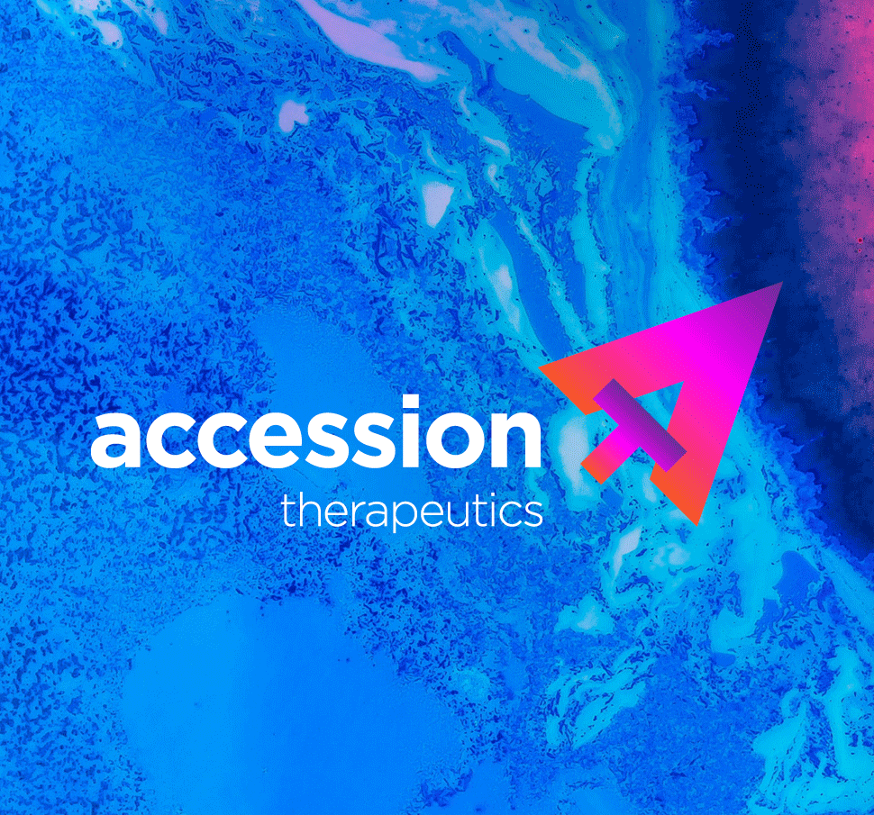
Design a logo with meaning, plus brand look and feel, website and animation style for a new BioMed company ‘Accession Therapeutics’. Whose objective is to create the next level of oncology treatment to tackle one of man’s greatest scourges - cancer.
The upward arrow icon symbolises this cause: forward looking, always advancing, aiming for our target – to unlock and gain access to cancer’s weakest points.
The logo also neatly integrates the company’s initials. In a step away from the expected corporate branding for a R&D company, we chose lively, vibrant colours, simple stylised graphics and abstract 3D medical animation
Branding | Website


bottom of page